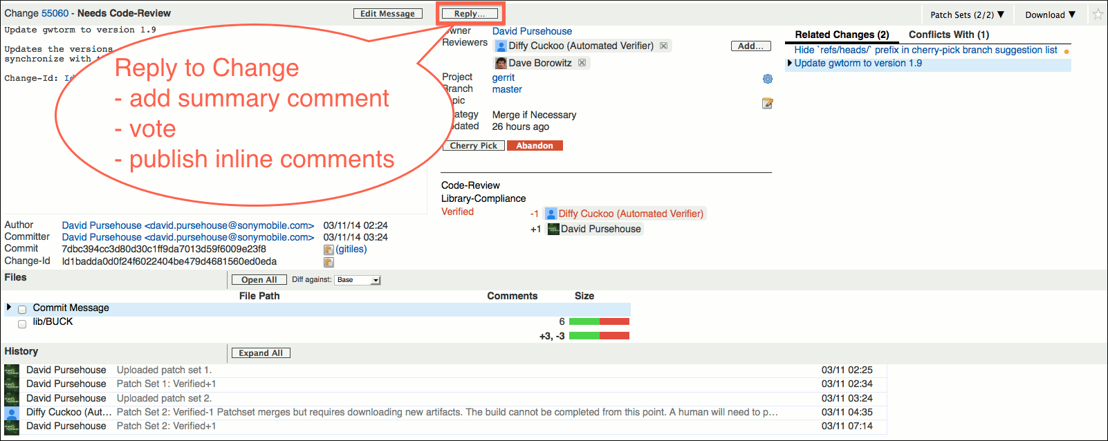
Reviewing changes is an important task and the Gerrit Web UI provides many functionalities to make the review process comfortable and efficient. This is a guide through the review UI that explains the different functions and UI elements.
Change Screen
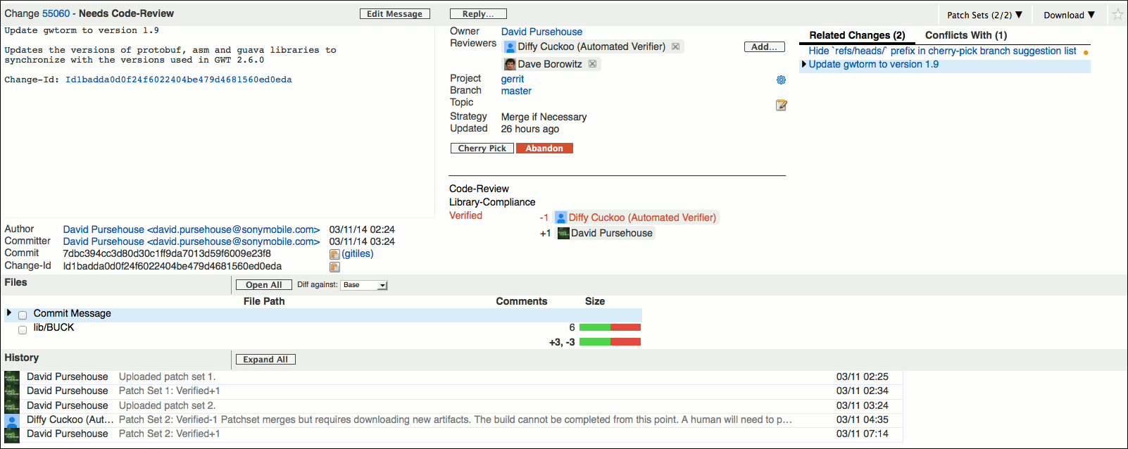
The change screen shows the details of a single change and provides various actions on it.
Commit Message Block
The focus of the change screen is on the commit message since this is the most important information about a change. The numeric change ID and the change status are displayed right above the commit message.
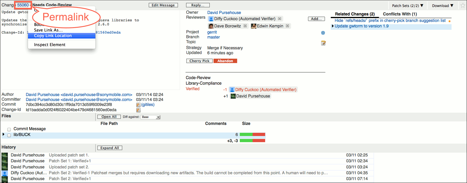
The numeric change ID is a link to the change and clicking on it refreshes the change screen. By copying the link location you can get the permalink of the change.
The change status shows the state of the change:
-
The change is in review and an approval on the shown label is still required to make the change submittable.
-
The change is in review and a veto vote on the shown label is preventing the submit.
-
The currently viewed patch set is outdated.
Please note that some operations, like voting, are not available on outdated patch sets, but only on the current patch set.
-
The change has all necessary approvals and may be submitted.
-
The change was successfully merged into the destination branch.
-
The change was abandoned.
Commit Info Block
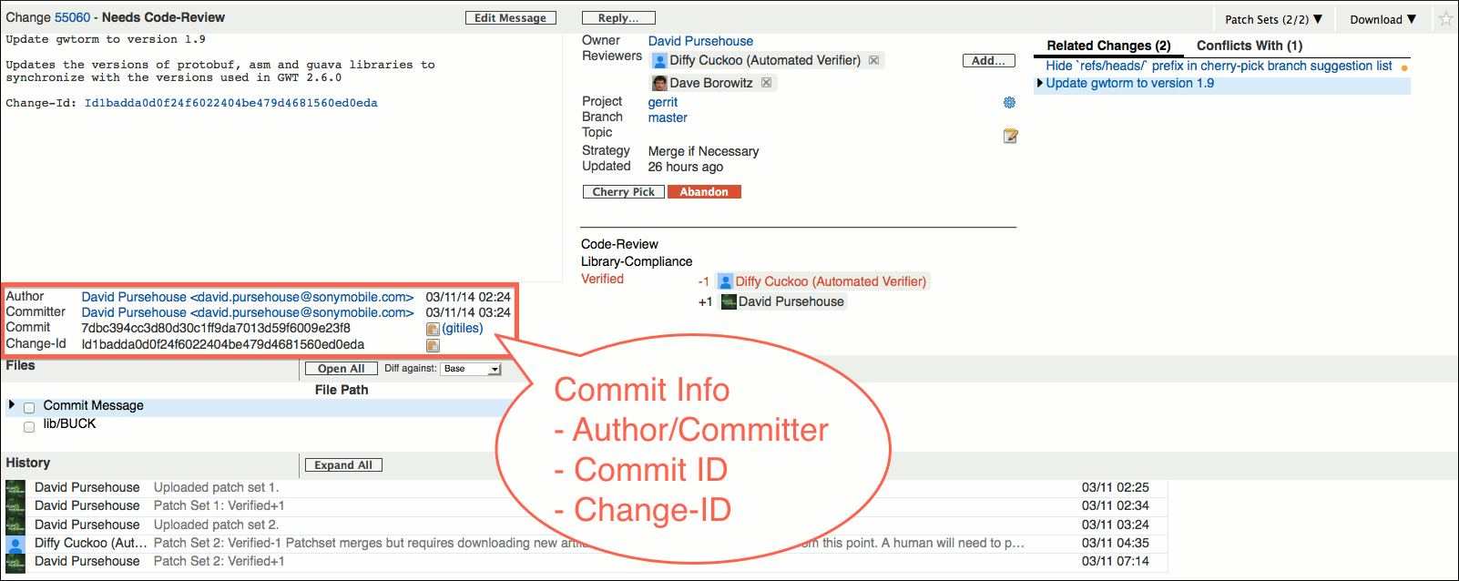
The commit info block shows information about the commit of the currently viewed patch set.
It displays the author and the committer as links to a list of this person’s changes that have the same status as the currently viewed change.
The commit ID, the parent commit(s) and the Change-Id are displayed with a copy-to-clipboard icon that allows the ID to be copied into the clipboard.
If a Git web browser, such as gitweb or Gitiles, is configured, there is also a link to the commit in the Git web browser.
If a merge commit is viewed this is highlighted by an icon.
Change Info Block
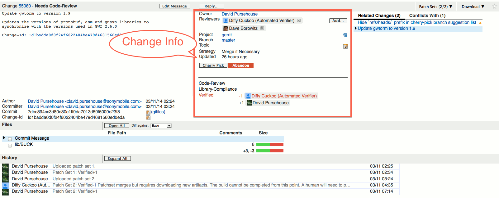
The change info block contains detailed information about the change and offers actions on the change.
-
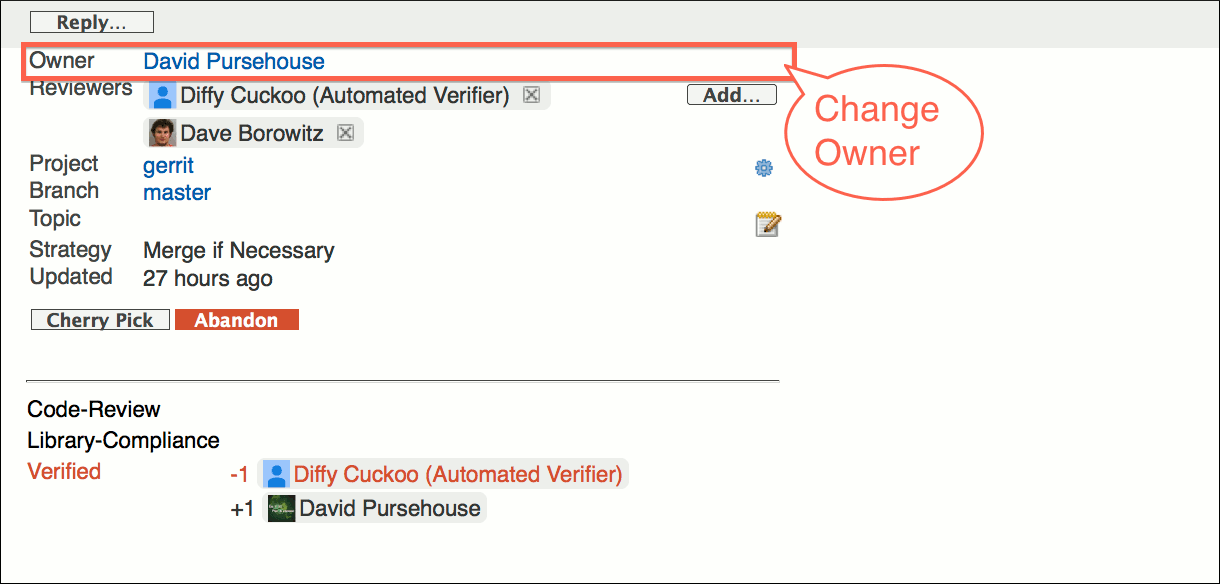
The owner of the change is displayed as a link to a list of the owner’s changes that have the same status as the currently viewed change.
-
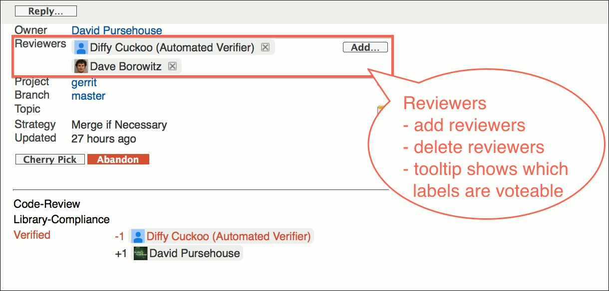
The reviewers of the change are displayed as chip tokens.
For each reviewer there is a tooltip that shows on which labels the reviewer is allowed to vote.
New reviewers can be added by clicking on the
Add…button. Typing into the pop-up text field activates auto completion of user and group names.Reviewers can be removed from the change by clicking on the
xicon in the reviewer’s chip token. Removing a reviewer also removes the current votes of the reviewer. The removal of votes is recorded as a message on the change.Removing reviewers is protected by permissions:
-
Users can always remove themselves.
-
The change owner may remove any zero or positive score.
-
Users with the Remove Reviewer access right, the branch owner, the project owner and Gerrit administrators may remove anyone.
-
-
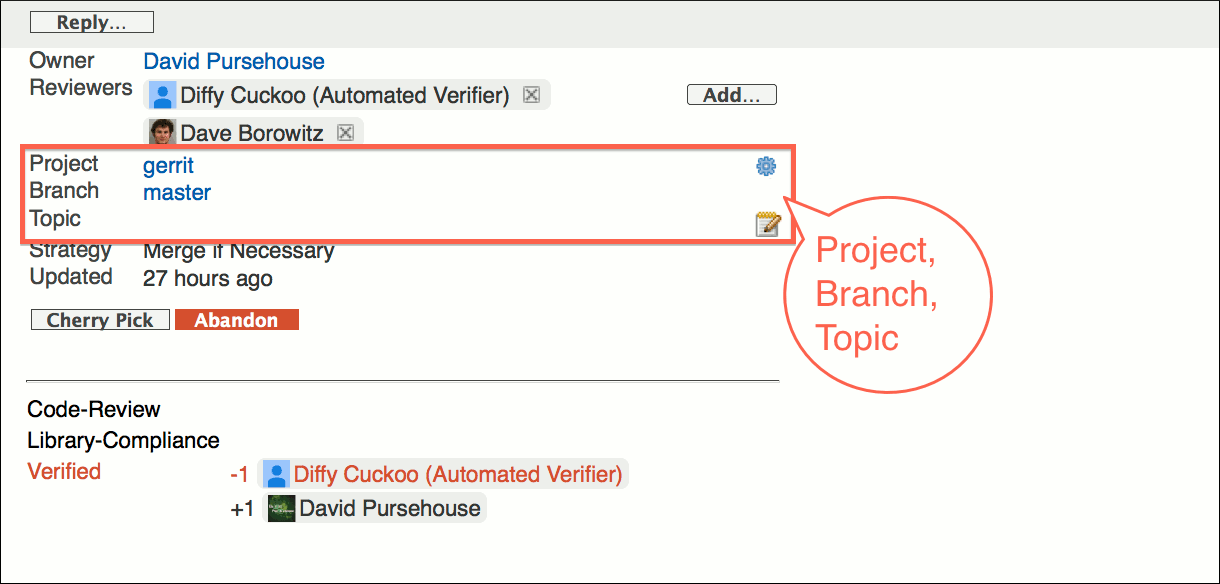
The name of the project for which the change was done is displayed as a link to the default dashboard of the project. If no default dashboard is defined, the link opens a list of open changes on the project.
Clicking on the settings icon on the right side navigates to the project administration screen.
The name of the destination branch is displayed as a link to a list with all changes on this branch that have the same status as the currently viewed change.
If a topic was assigned to the change it is displayed below the branch. By clicking on the edit icon the topic can be set. This requires the Edit Topic Name access right. To be able to set a topic on a closed change, the
Edit Topic Namemust be assigned with theforceflag. -
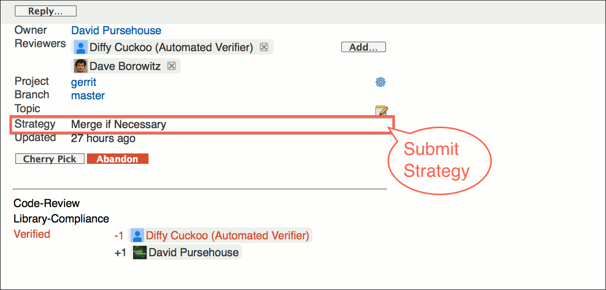
The submit strategy that will be used to submit the change. The submit strategy is only displayed for open changes.
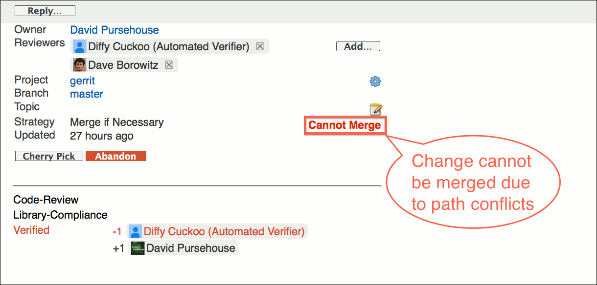
If a change cannot be merged due to path conflicts this is highlighted by a bold red
Cannot Mergelabel. -
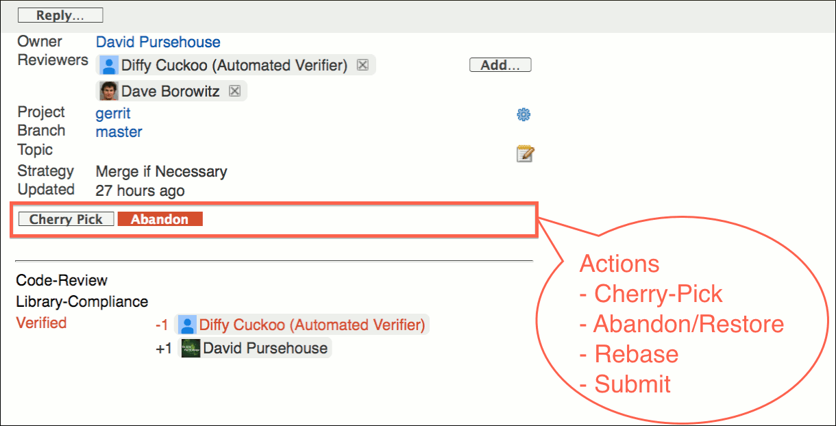
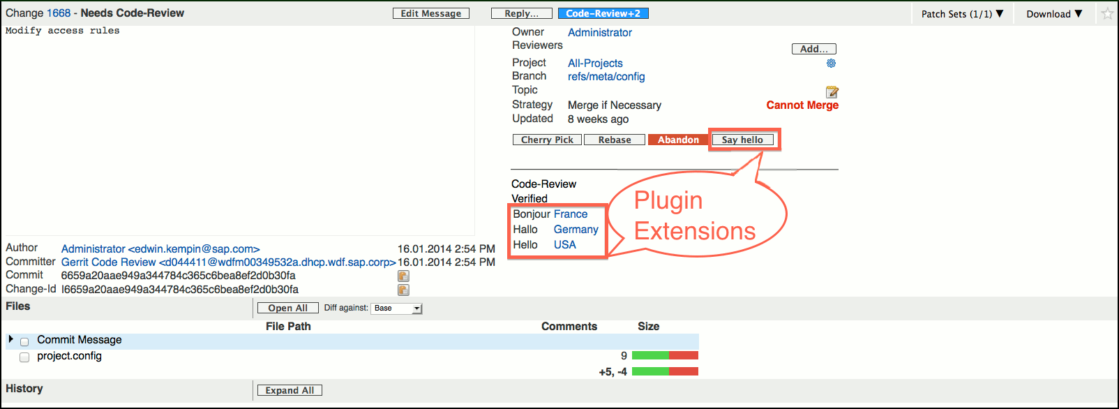
Depending on the change state and the permissions of the user, different actions are available on the change:
-
Submits the change and adds it to the merge queue. If possible the change is merged into the destination branch.
The
Submitbutton is available if the change is submittable and the Submit access right is assigned. -
Reverts the change via creating a new one.
The
Revertbutton is available if the change has been submitted.When the
Revertbutton is pressed, a panel will appear to allow the user to enter a commit message for the reverting change.Once a revert change is created, the original author and any reviewers of the original change are added as reviewers and a message is posted to the original change linking to the revert.
-
Abandons the change.
The
Abandonbutton is only available if the change is open and the Abandon access right is assigned.When a change is abandoned, a panel appears that allows one to type a comment message to explain why the change is being abandoned.
-
Restores the change.
The
Restorebutton is only available if the change is abandoned and the Abandon and the Push access right is assigned.When a change is restored, a panel appears that allows one to type a comment message to explain why the change is being restored.
-
Rebases the change. The rebase is always done with content merge enabled. If the rebase is successful a new patch set with the rebased commit is created. If the rebase fails, there are conflicts that have to be resolved manually.
If the change does not depend on another open change, it is rebased onto the tip of the destination branch.
If the change depends on another open change, it is rebased onto the current patch set of that other change.
It is possible to change parent revision of a change. The new parent revision can be another change towards the same target branch, or the tip of the target branch.
The
Rebasebutton is only available if the Rebase access right is assigned. Rebasing merge commits is not supported. -
Allows to cherry-pick the change to another branch. The destination branch can be selected from a dialog. Cherry-picking a change creates a new open change on the selected destination branch.
It is also possible to cherry-pick a change to the same branch. This is effectively the same as rebasing it to the current tip of the destination branch. This can be used to remove dependencies on other open changes.
Users can only cherry-pick changes to branches for which they are allowed to upload changes for review.
-
Delete Change/Delete Revision:Deletes the change.
For open or abandoned changes, the
Delete Changebutton will be available and if the user is the change owner and is granted the Delete Own Changes permission, if they are granted the Delete Changes permission, or if they are an administrator.
-
-
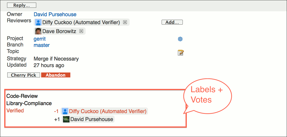
Approving votes are colored green; veto votes are colored red.
File List
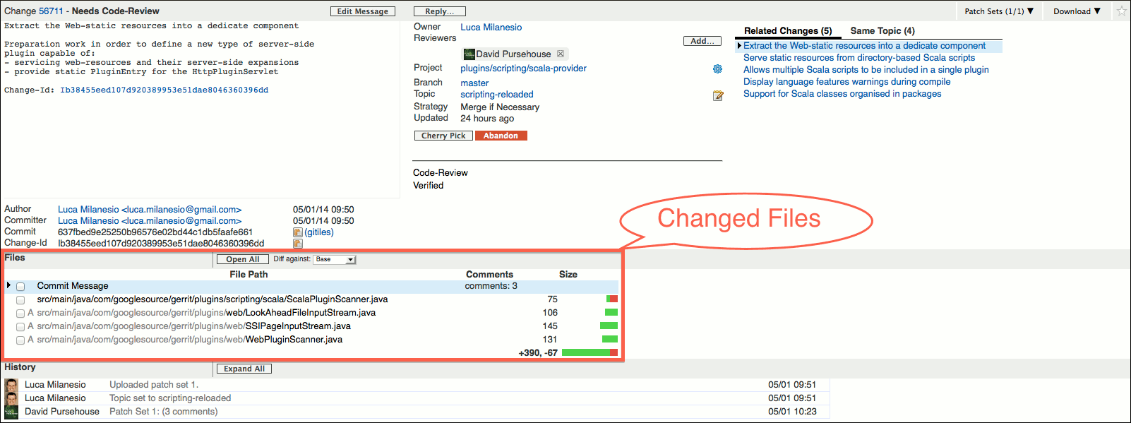
The file list shows the files that are modified in the currently viewed patch set.
In addition to the modified files the file list contains magic files that are generated by Gerrit and which don’t exist in the repository. The magic files contain additional commit data that should be reviewable and allow users to comment on this data. The magic files are always listed first. The following magic files exist:
-
Commit Message:The commit message and headers with the parent commit(s), the author information and the committer information.
-
Merge List(for merge commits only):The list of commits that are being integrated into the destination branch by submitting the merge commit.
The checkboxes in front of the file names allow files to be marked as reviewed.
The type of a file modification is indicated by the character in front of the file name:
-
Mor 'no character' (Modified):The file existed before this change and is modified.
-
A(Added):The file is newly added.
-
D(Deleted):The file is deleted.
-
R(Renamed):The file is renamed.
-
C(Copied):The file is new and is copied from an existing file.
-
U(Unchanged):The file is unchanged and has the same content. Unchanged files only appear in the file list if 2 patch sets are compared and the file has comments on at least one of the sides. Otherwise unchanged files are filtered out.
If a file is renamed or copied, the name of the original file is displayed in gray below the file name.
Repeating path segments are grayed out.
Inline comments on a file are shown in the Comments column.
Draft comments, i.e. comments that have been written by the current user but not yet published, are highlighted in red.
New comments from other users, that were published after the current user last reviewed this change, are highlighted in bold.
The size of the modifications in the files can be seen in the Size column. The
footer row shows the total size of the change.
The size information is useful to easily spot the files that contain the most modifications; these files are likely to be the most relevant files for this change. The total change size gives an estimate of how long a review of this change may take.
When the "Show Change Sizes As Colored Bars" user preference is enabled, the
Size column shows the sum of inserted and deleted lines as one number. In
addition, the change size is shown as a bar. The size of the bar indicates the
amount of changed lines, and its coloring shows the proportion of insertions
(green) to deletions (red).
When the "Show Change Sizes As Colored Bars" user preference is disabled, the
colored bar is not shown. For added and renamed files, the Size column
shows the number of inserted and deleted lines. For new files, the column only
shows the total number of lines in the new file. No size is shown for binary
files and deleted files.
In the header of the file list, the Diff Against selection can be
changed. This selection allows one to choose if the currently viewed
patch set should be compared against its base or against another patch
set of this change. The file list is updated accordingly.
The file list header also provides an Open All button that opens the
diff views for all files in the file list.
Patch Sets
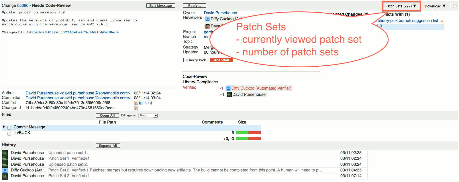
The change screen only presents one patch set at a time. Which patch
set is currently viewed can be seen from the Patch Sets drop-down
panel in the change header. It shows the number of the currently viewed
patch set and the total number of patch sets, in the form: "current
patch set/number of patch sets".
If a non-current patch set is viewed this is indicated by the Not Current change state. Please note that some operations are only available on the current patch set.
Another indication is a highlighted drop-down label.
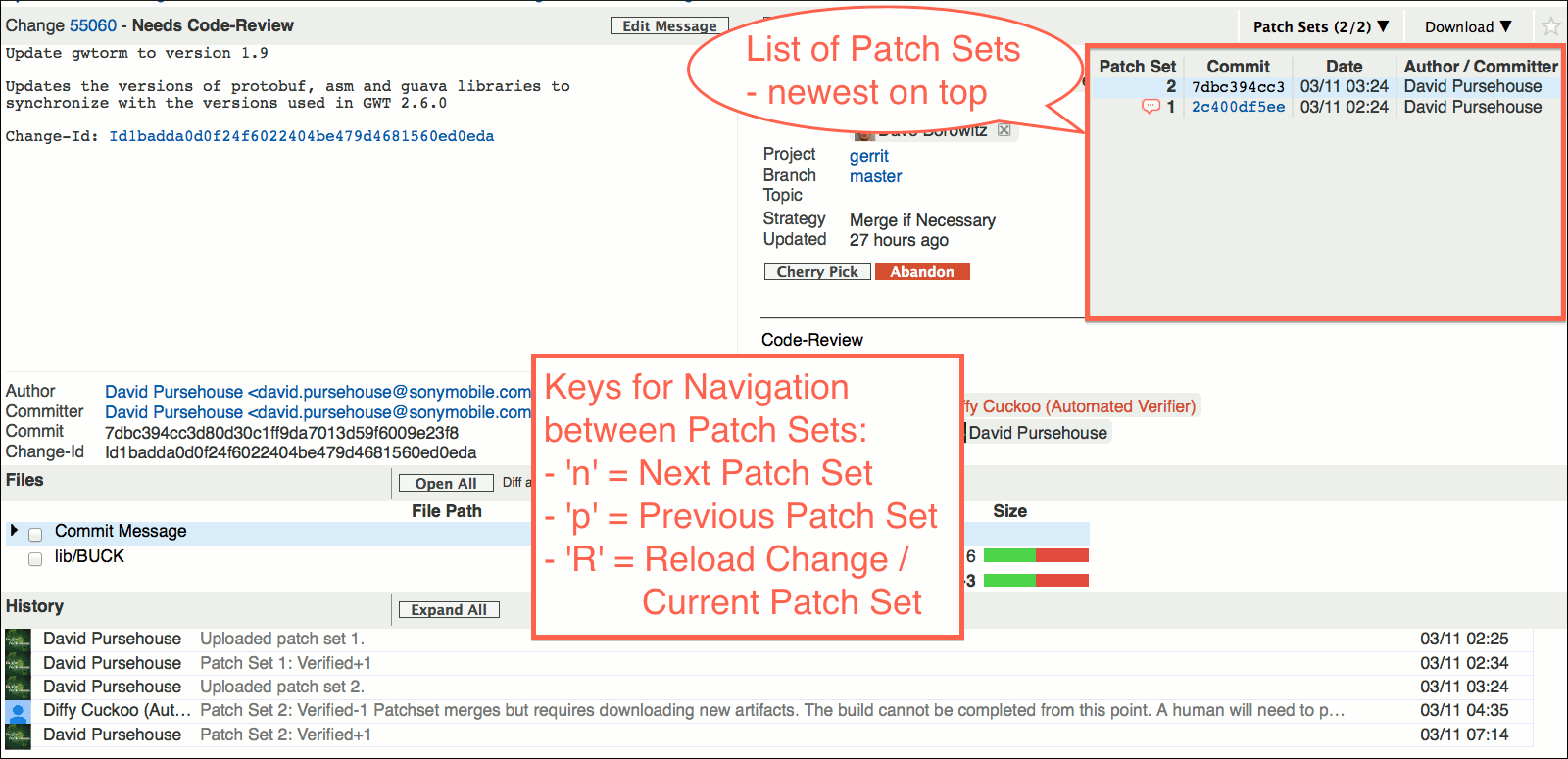
The patch set drop-down list shows the list of patch sets and allows to switch between them. The patch sets are sorted in descending order so that the current patch set is always on top.
Draft patch sets are marked with DRAFT.
Download
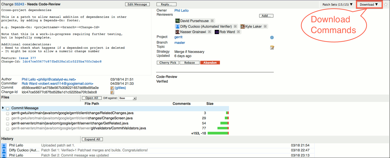
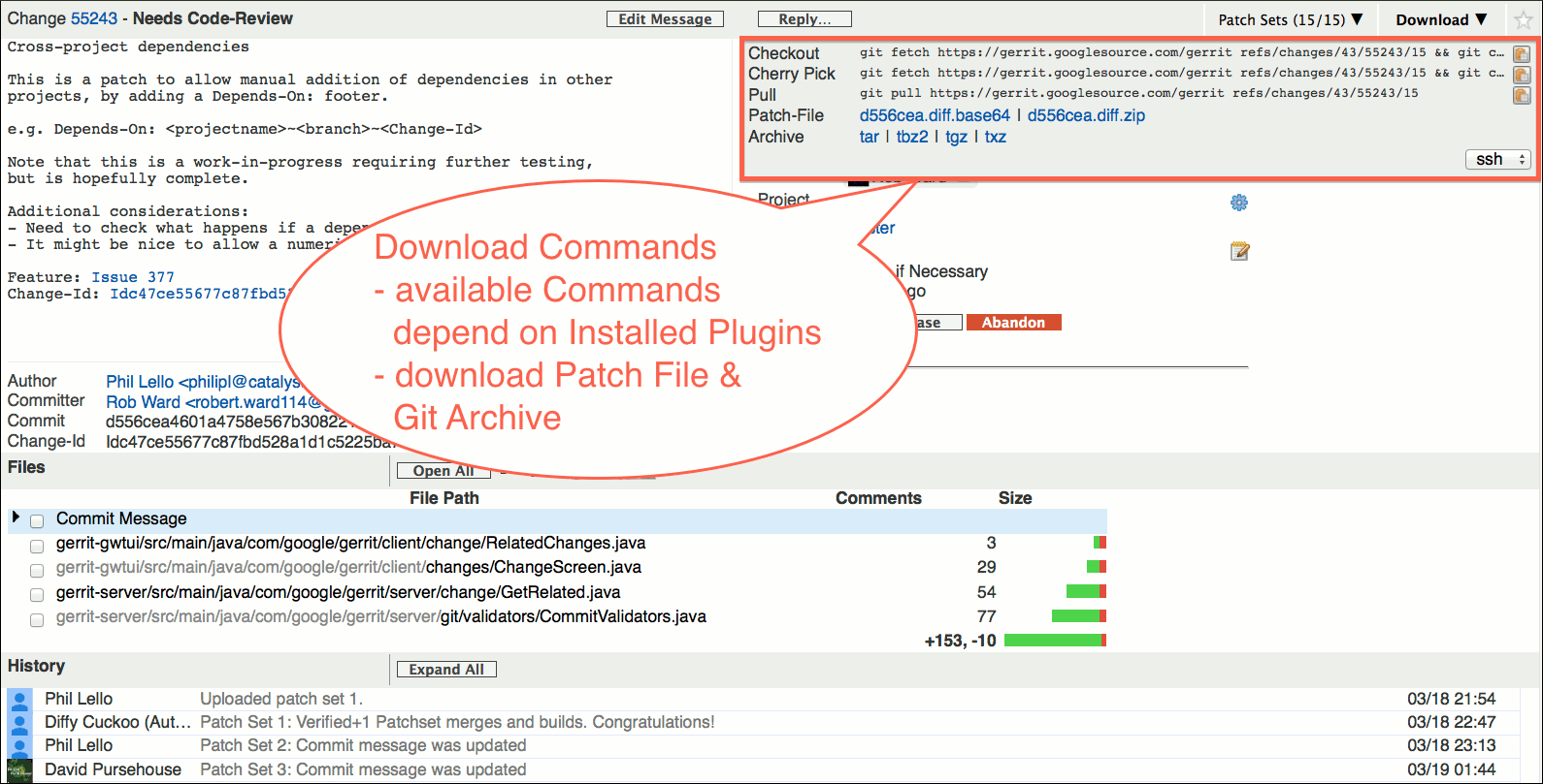
The Download drop-down panel in the change header offers commands and
links for downloading the currently viewed patch set.
The available download commands depend on the installed Gerrit plugins. The most popular plugin for download commands, the download-commands plugin, provides commands to checkout, pull and cherry-pick a patch set.
Each command has a copy-to-clipboard icon that allows the command to be copied into the clipboard. This makes it easy to paste and execute the command on a Git command line.
If several download schemes are configured on the server (e.g. SSH and HTTP) there is a drop-down list to switch between the download schemes. Gerrit automatically remembers the download scheme that was last chosen and selects this download scheme the next time the download commands drop-down panel is opened.
The Patch-File links provide the Git patch file for the currently
viewed patch set for download. The patch file can be base64 encoded or
zipped.
The Archive links allow one to download an archive with the contents
of the currently viewed patch set. The archive is offered in several
formats (e.g. tar and tbz2); which formats are available depends on the
configuration of the server.
Included In
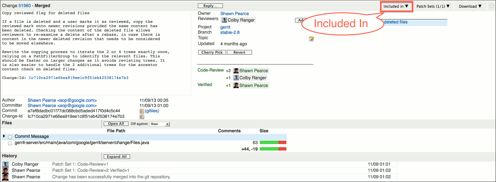
For merged changes the Included In drop-down panel is available in
the change header.
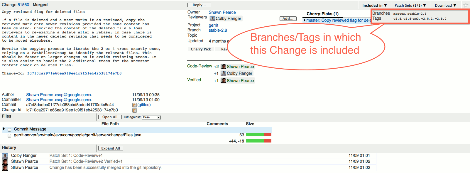
The Included In drop-down panel shows the branches and tags in which
the change is included. E.g. if a change fixes a bug, this allows to
quickly see in which released versions the bug-fix is contained
(assuming that every release is tagged).
Star Change
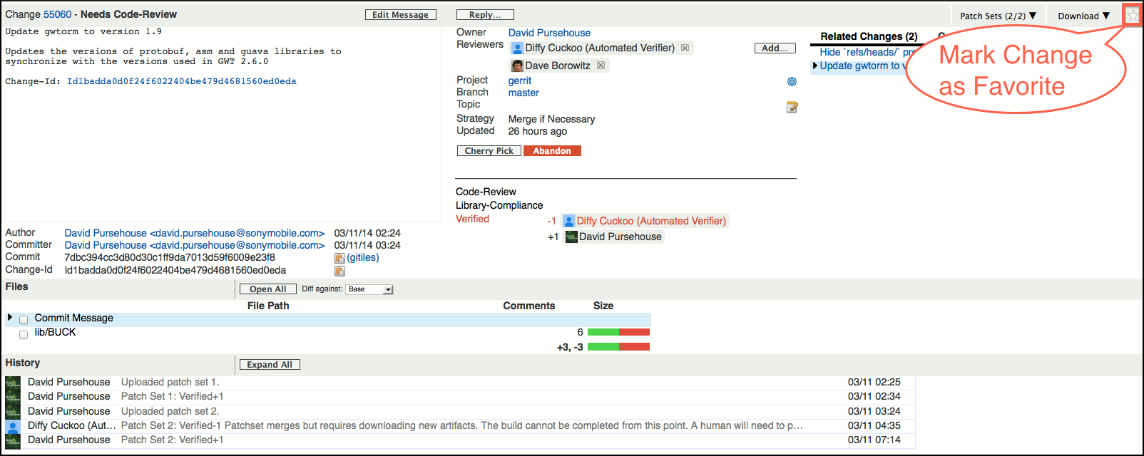
The star icon in the change header allows to mark the change as a favorite. Clicking on the star icon again, unstars the change.
Starring a change turns on email notifications for this change.
Starred changed are listed under My > Starred Changes.
and can be queried by the is:starred search
operator.
Related Changes
If there are changes that are related to the currently viewed change they are displayed in the third column of the change screen.
There are several lists of related changes and a tab control is used to display each list of related changes in its own tab.
The following tabs may be displayed:
-
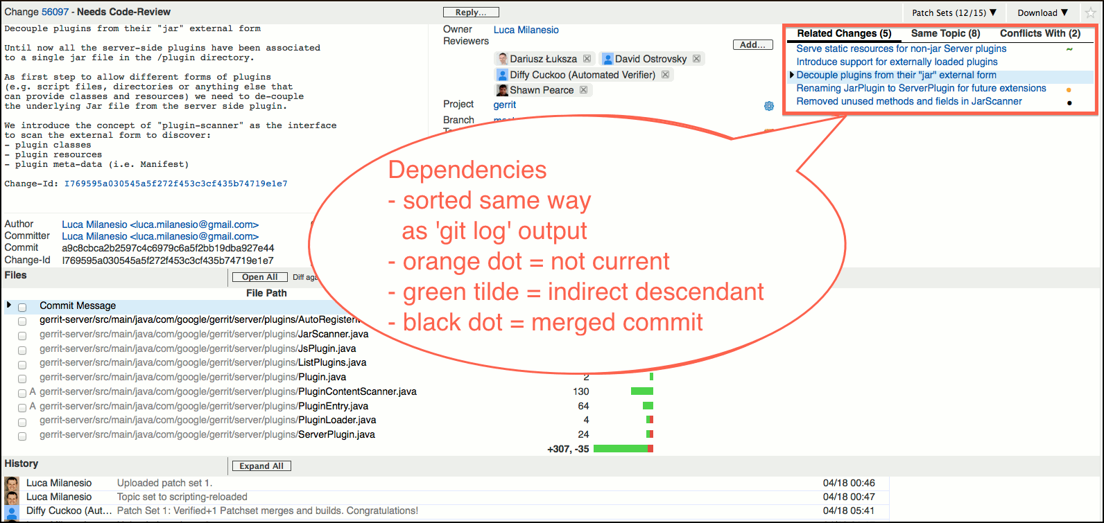
This tab page shows changes on which the current change depends (ancestors) and open changes that depend on the current change (descendants). For merge commits it also shows the closed changes that will be merged into the destination branch by submitting the merge commit.
The changes are sorted in the same way as the output of 'git log'. This means the relationship between the changes can be inferred from the position of the changes in the list. Changes listed above the current change are descendants; changes below the current change are ancestors.
For merged changes this tab is only shown if there are open descendants.
Related changes may be decorated with an icon to signify dependencies on outdated patch sets, or commits that are not associated to changes under review:
-
The selected patch set of the change is outdated; it is not the current patch set of the change.
If an ancestor change is marked with an orange dot it means that the currently viewed patch set depends on a outdated patch set of the ancestor change. This is because a new patch set for the ancestor change was uploaded in the meantime and as result the currently viewed patch set now needs to be rebased.
If a descendant change is marked with an orange dot it means that an old patch set of the descendant change depends on the currently viewed patch set. It may be that the descendant was rebased in the meantime and with the new patch set this dependency was removed.
-
The selected patch set of the change is an indirect descendant of the currently viewed patch set; it has a dependency to another patch set of this change. E.g. this could mean that a new patch set was uploaded for this change and the descendant change now needs to be rebased. Please note that following the link to an indirect descendant change may result in a completely different related changes listing.
-
Indicates a closed ancestor, e.g. the commit was directly pushed into the repository bypassing code review, or the ancestor change was reviewed and submitted on another branch. The latter may indicate that the user has accidentally pushed the commit to the wrong branch, e.g. the commit was done on
branch-a, but was then pushed torefs/for/branch-b. A black dot is also present if the change was abandoned. -
When the commit is abandoned, its subject line will be striked through.
-
-
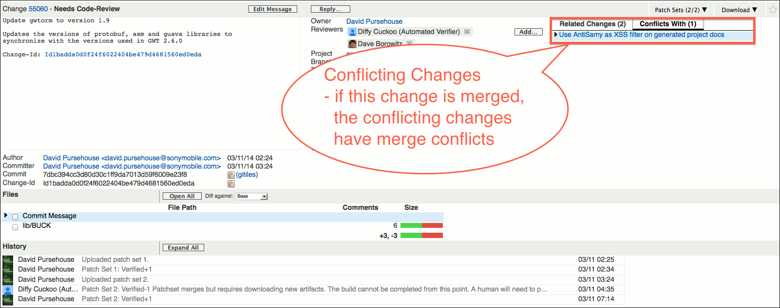
This tab page shows changes that conflict with the current change. Non-mergeable changes are filtered out; only conflicting changes that are mergeable are shown.
If this change is merged, its conflicting changes will have merge conflicts and must be rebased. The rebase of the other changes with the conflict resolution must then be done manually.
-
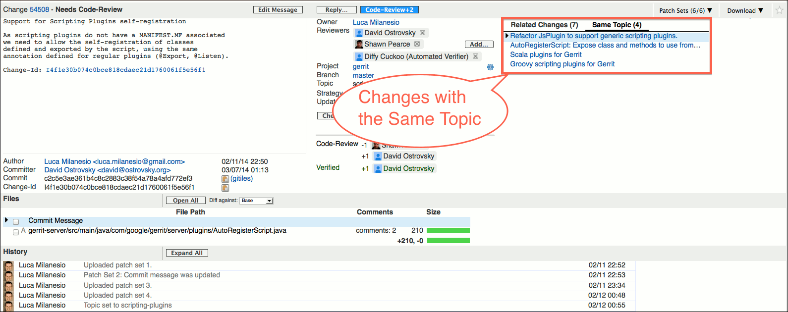
This tab page shows changes that have the same topic as the current change. Only open changes are included in the list.
-
This tab page shows changes that will be submitted together with the currently viewed change, when clicking the submit button. It includes ancestors of the current patch set.
This may include changes and its ancestors with the same topic if
change.submitWholeTopicis enabled. Only open changes with the same topic are included in the list. -
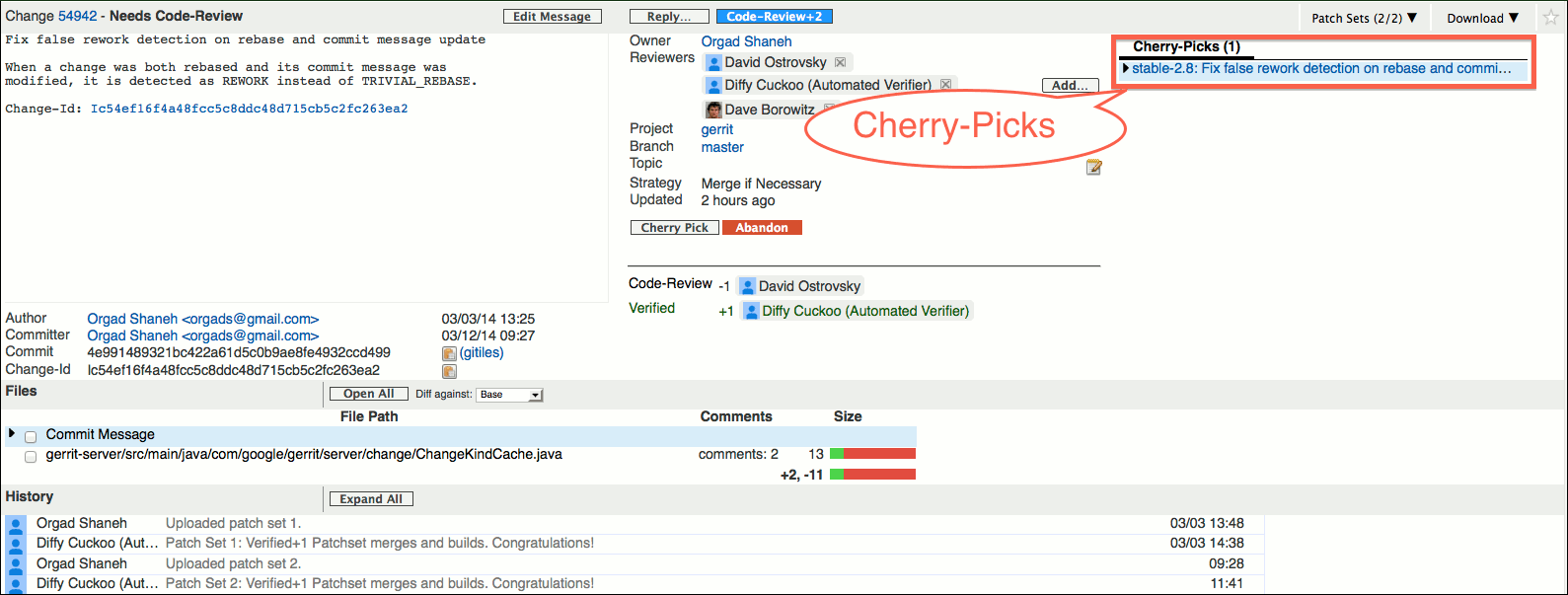
This tab page shows changes with the same Change-Id for the current project.
Abandoned changes are filtered out.
For each change in this list the destination branch is shown as a prefix in front of the change subject.
If there are no related changes for a tab, the tab is not displayed.
Reply
The Reply… button in the change header allows to reply to the
currently viewed patch set; one can add a summary comment, publish
inline draft comments, and vote on the labels.
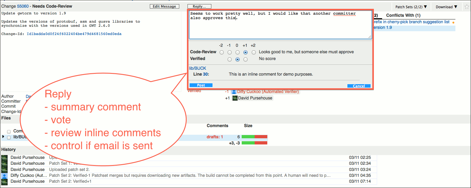
Clicking on the Reply… button opens a popup panel.
A text box allows to type a summary comment for the currently viewed patch set. Some basic markdown-like syntax is supported which renders indented lines preformatted, lines starting with "- " or "* " as list items, and lines starting with "> " as block quotes (also see replying to messages and inline comments).
Note that you can set the text and tooltip of the button in gerrit.config.
If the current patch set is viewed, radio buttons are displayed for each label on which the user is allowed to vote. Voting on non-current patch sets is not possible.
The inline draft comments that will be published are displayed in a separate section so that they can be reviewed before publishing. There are links to navigate to the inline comments which can be used if a comment needs to be edited.
The Post button publishes the comments and the votes.
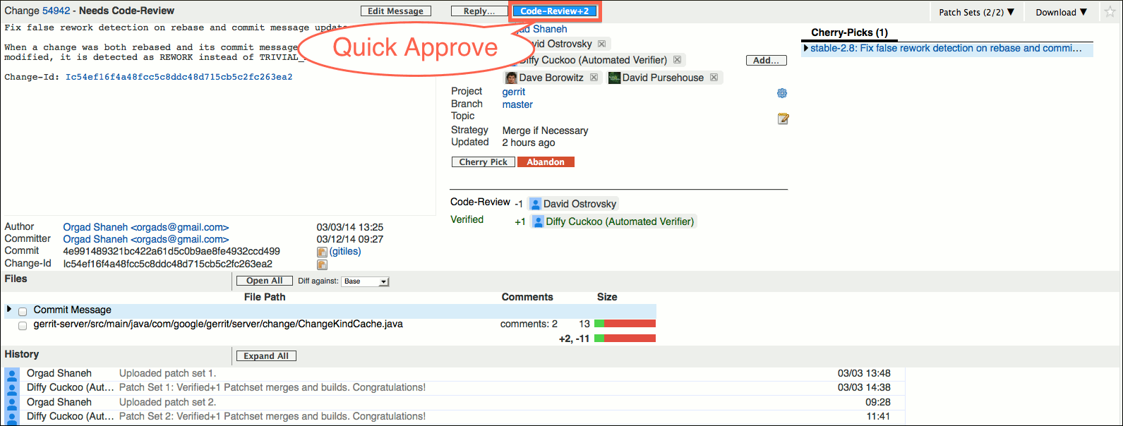
If a user can approve a label that is still required, a quick approve button appears in the change header that allows to add this missing approval by a single click. The quick approve button only appears if there is a single label that is still required and can be approved by the user.
E.g. if a change requires approvals on the 'Code-Review' and the
'Verified' labels, and there is already a '+1 Verified' vote, then
if the user is allowed to vote the max score on 'Code-Review', a
Code-Review+2 quick approve button appears that approves the
'Code-Review' label if clicked.
Using the quick approve button also publishes all inline draft comments; a summary comment is only added if the reply popup panel is open when the quick approve button is clicked.
History
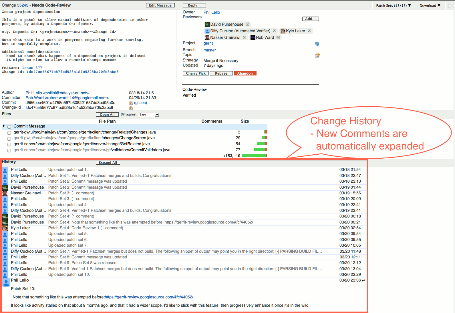
The history of the change can be seen in the lower part of the screen.
The history contains messages for all kinds of change updates, e.g. a message is added when a new patch set is uploaded or when a review was done.
Messages with new comments from other users, that were published after the current user last reviewed this change, are automatically expanded.
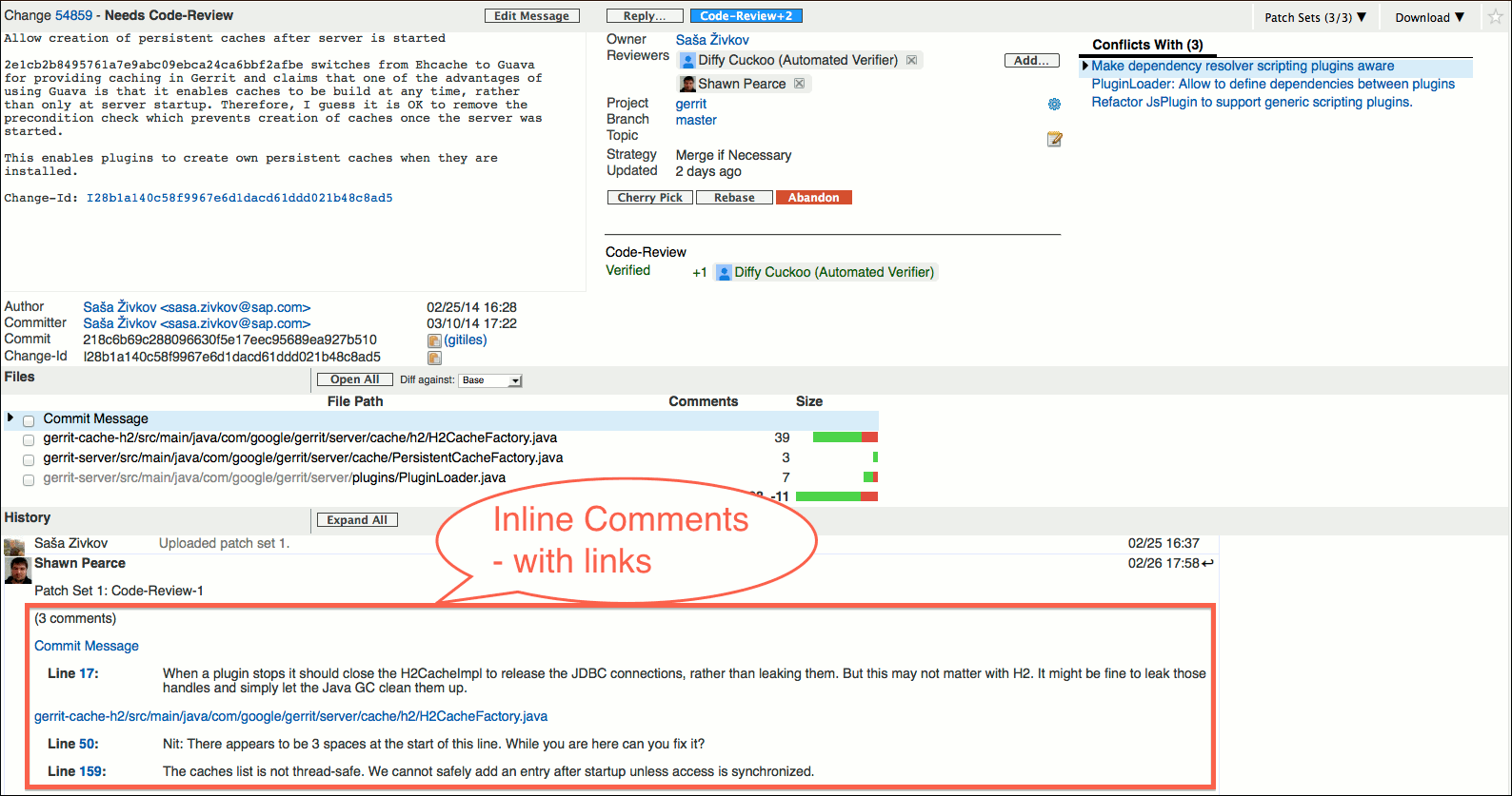
Inline comments are directly displayed in the change history and there are links to navigate to the inline comments.
The Expand All button expands all messages; the Collapse All button
collapses all messages.
Update Notification
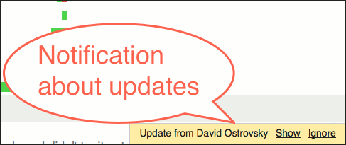
The change screen automatically polls for updates to the currently viewed change. If there is an update the user is informed by a popup panel in the bottom right corner.
The polling frequency depends on the server configuration; by default it is 30 seconds. Polling may also be completely disabled by the administrator.
Side-by-Side Diff Screen
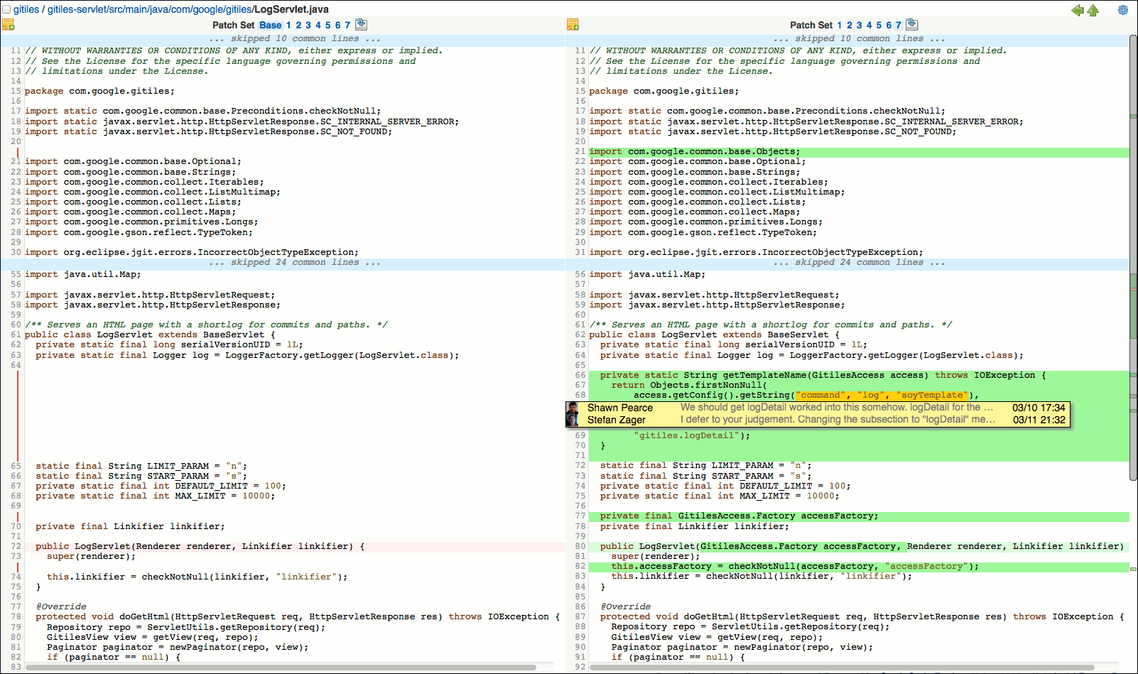
The side-by-side diff screen shows a single patch; the old file version is displayed on the left side of the screen; the new file version is displayed on the right side of the screen.
This screen allows to review a patch and to comment on it.
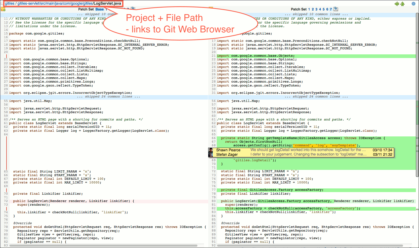
In the screen header the project name and the name of the viewed patch file are shown.
If a Git web browser is configured on the server, the project name and the file path are displayed as links to the project and the folder in the Git web browser.
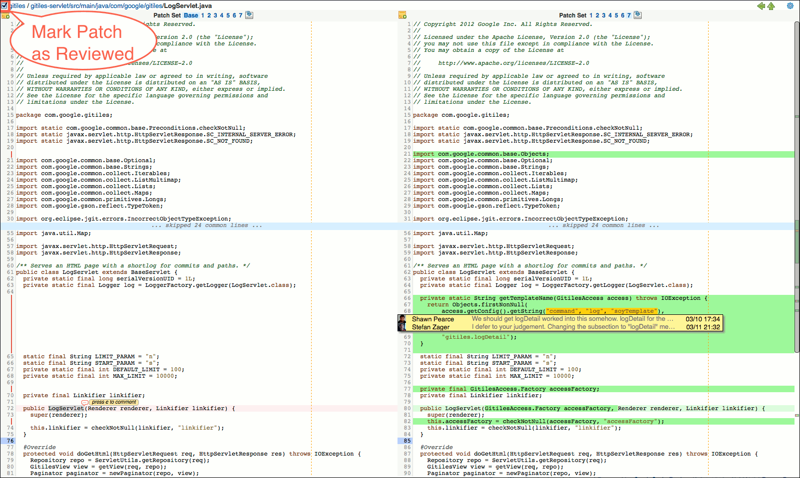
The checkbox in front of the project name and the file name allows the patch to be marked as reviewed. The Mark Reviewed diff preference allows to control whether the files should be automatically marked as reviewed when they are viewed.
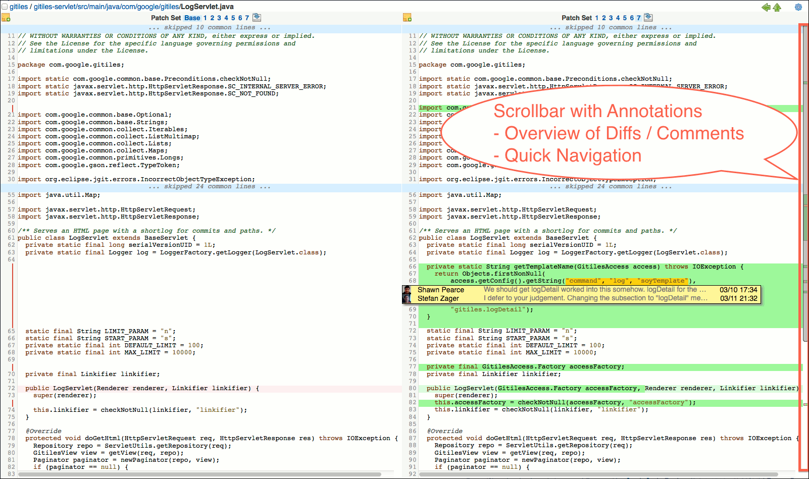
The scrollbar shows patch diffs and inline comments as annotations. This provides a good overview of the lines in the patch that are relevant for reviewing. By clicking on an annotation one can quickly navigate to the corresponding line in the patch.
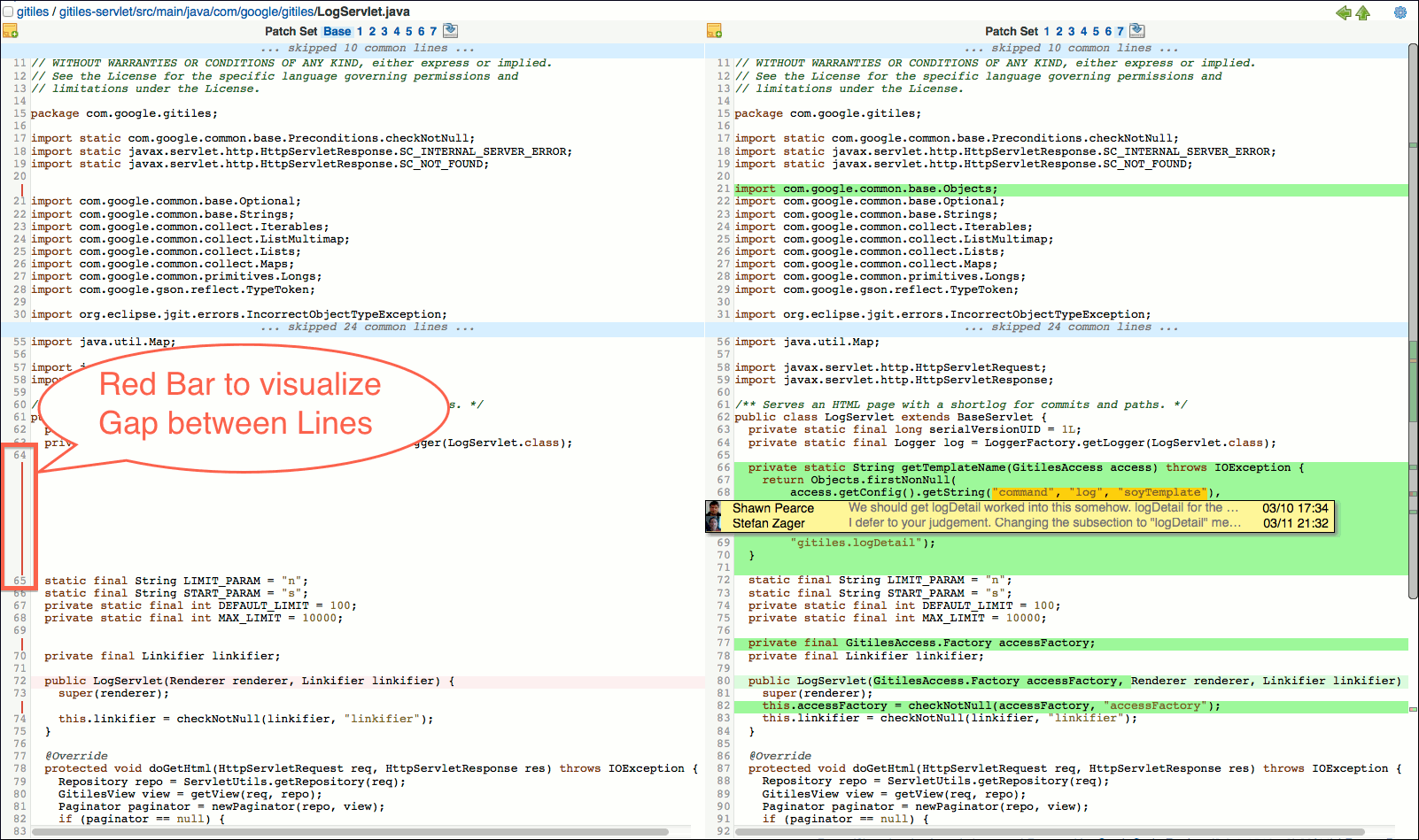
A gap between lines in the file content that is caused by aligning the left and right side or by displaying inline comments is shown as a vertical red bar in the line number column. This prevents a gap from being mistaken for blank lines in the file
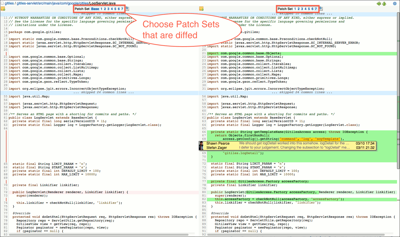
In the header, on each side, the list of patch sets is shown. Clicking on a patch set changes the selection for the patch set comparison and the screen is refreshed to show the diff between the selected patch sets. The currently selected patch set is highlighted by a light blue background.
On the left side Base can be selected to compare a patch set against
its base. For merge commits Auto Merge is available instead which
allows to compare the patch against the result of the auto merge. The
auto merge version may contain Git conflict markers and is useful for
reviewing how conflicts are resolved by a patch.
Reviewers that are reviewing a patch for the first time look at its diff against its base; reviewers that have reviewed an old patch version before, may see what has changed since that version by comparing the old patch against the current patch.
The download icon next to the patch set list allows to download the patch. Unless the mime type of the file is configured as safe, the download file is a zip archive that contains the patch file.
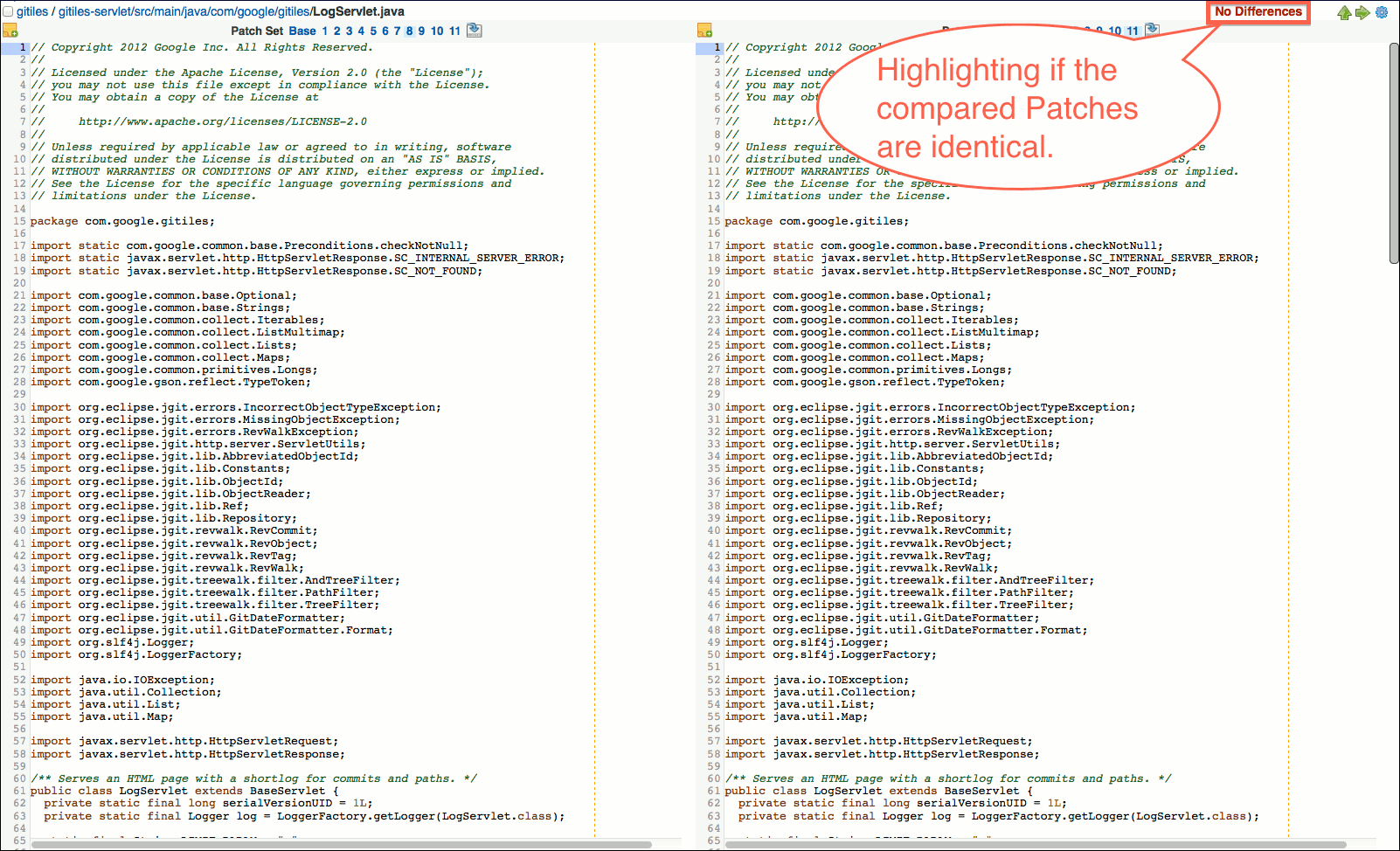
If the compared patches are identical, this is highlighted by a red
No Differences label in the screen header.
If a file was renamed, the old and new file paths are shown in the header together with a similarity index that shows how much of the file content is unmodified.
Inline Comments
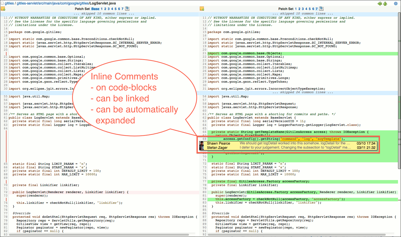
Inline comments are displayed directly in the patch file under the code that is commented. Inline comments can be placed on lines or on code blocks.
If an inline comment relates to a code block, this code block is highlighted by a yellow background.
Code blocks with comments may overlap. This means it is possible to attach several comments to the same code.
The lines of the patch file are linkable. To link to a certain line in
the patch file, '@<line-number>' must be appended to the patch link,
e.g. http://host:8080/#/c/56857/2/Documentation/user-review-ui.txt@665.
To link to a line in the old file version, '@a<line-number>' must be
appended to the patch link. These links can be used to directly link to
certain inline comments.
If the diff preference Expand All Comments
is set to Expand, all inline comments will be automatically expanded.
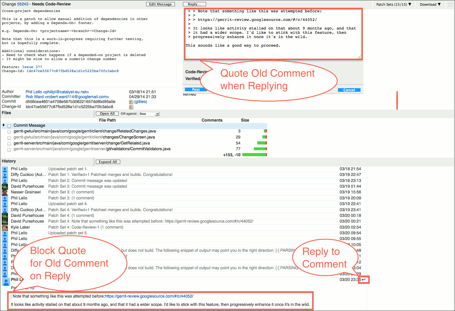
In the header of the comment box, the name of the comment author and the timestamp of the comment are shown. If avatars are configured on the server, the avatar image of the comment author is displayed in the top left corner. Below the actual comment there are buttons to reply to the comment.
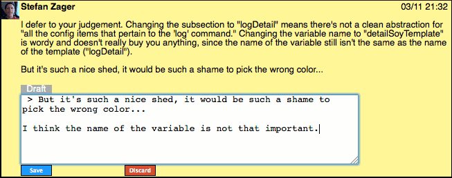
Quoting is supported, but only by manually copying & pasting the old comment that should be quoted and prefixing every line by "> ". Please note that for a correct rendering it is important to leave a blank line between a quoted block and the reply to it.
Clicking on the Save button saves the comment as a draft. To make it
visible to other users it must be published from the change screen by
replying to the change.
The Cancel button cancels the editing and discards any changes to the
draft comment.
Clicking on the Discard button deletes the inline draft comment.
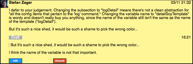
Draft comments are marked by the text "Draft" in the header in the place of the comment author.
A draft comment can be edited by clicking on the Edit button, or
deleted by clicking on the Discard button.
Clicking on the Done button is a quick way to reply with "Done" to a
comment. This is used to mark a comment as addressed by a follow-up
patch set.
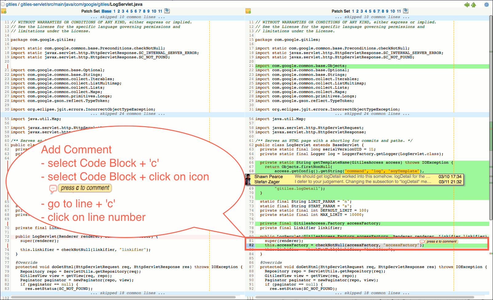
To add a new inline comment there are several possibilities:
-
select a code block and press 'c'
-
select a code block and click on the popup comment icon
-
go to a line, by clicking on it or by key navigation, and press 'c'
-
click on a line number
There are many ways to select code for commenting on it. The most frequently used methods are:
-
by mouse:
-
click and drag with the mouse to select a block
-
double-click on a word to select it
-
double-click and drag with the mouse to select a code block word-wise
-
triple-click on a line to select it
-
triple-click and drag with the mouse to select a code block line-wise
-
-
by keys (the same keys that are used for visual selection in Vim):
-
press 'v' + arrow keys (or 'h', 'j', 'k', 'l') to select a block
-
press 'V' + arrow keys (or 'j', 'k') to select a code block line-wise
-
type 'bvw' to select a word
-
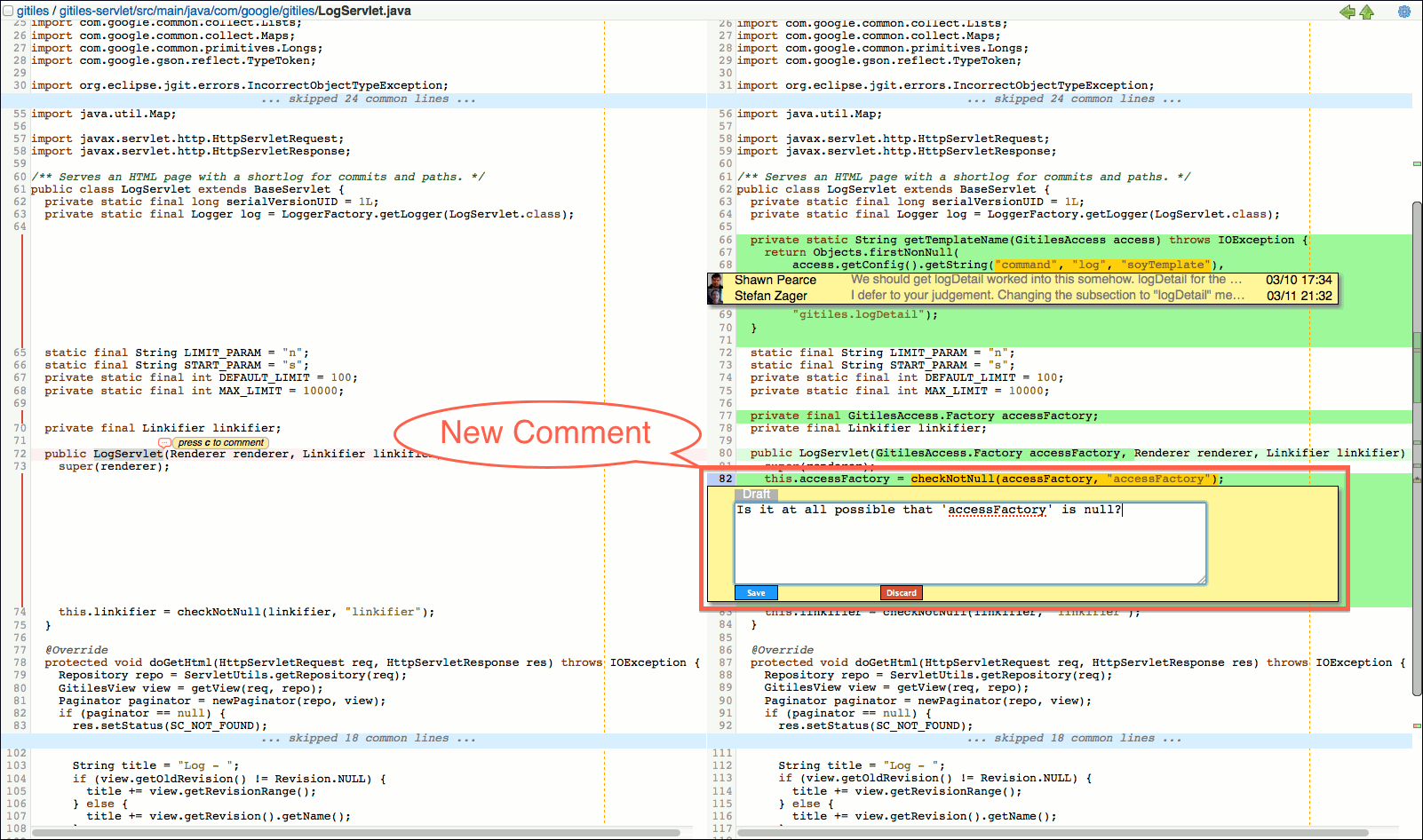
For typing the new comment, a new comment box is shown under the code that is commented.
Clicking on the Save button saves the new comment as a draft. To make
it visible to other users it must be published from the change screen
by replying to the change.
Clicking on the Discard button deletes the new comment.
File Level Comments
Comments that apply to a whole file can be added on file level.
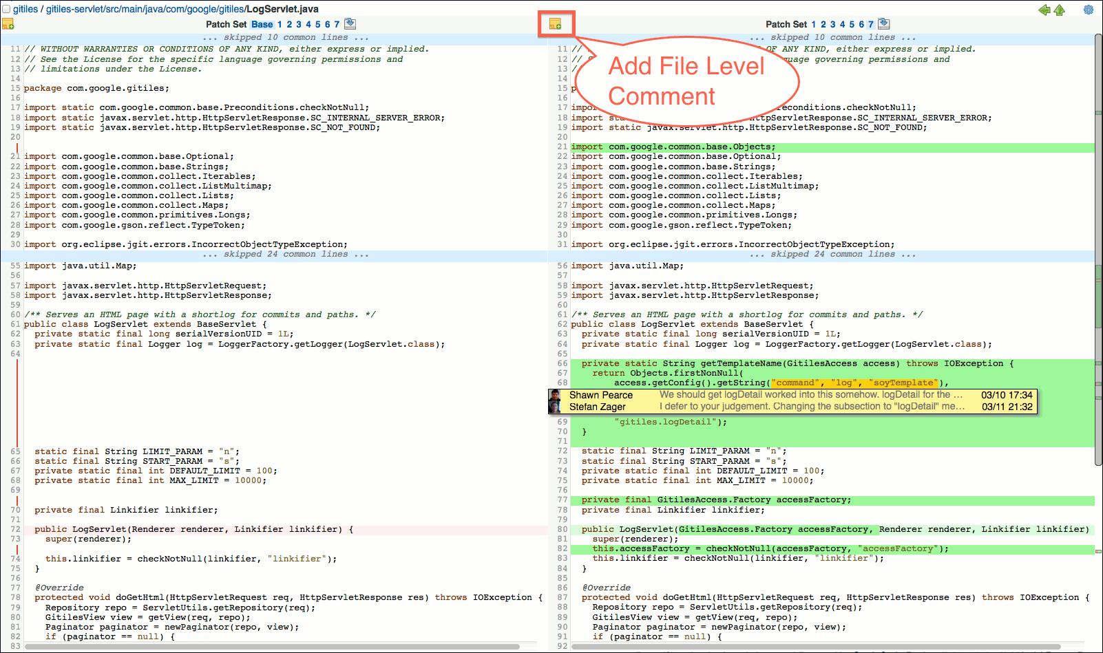
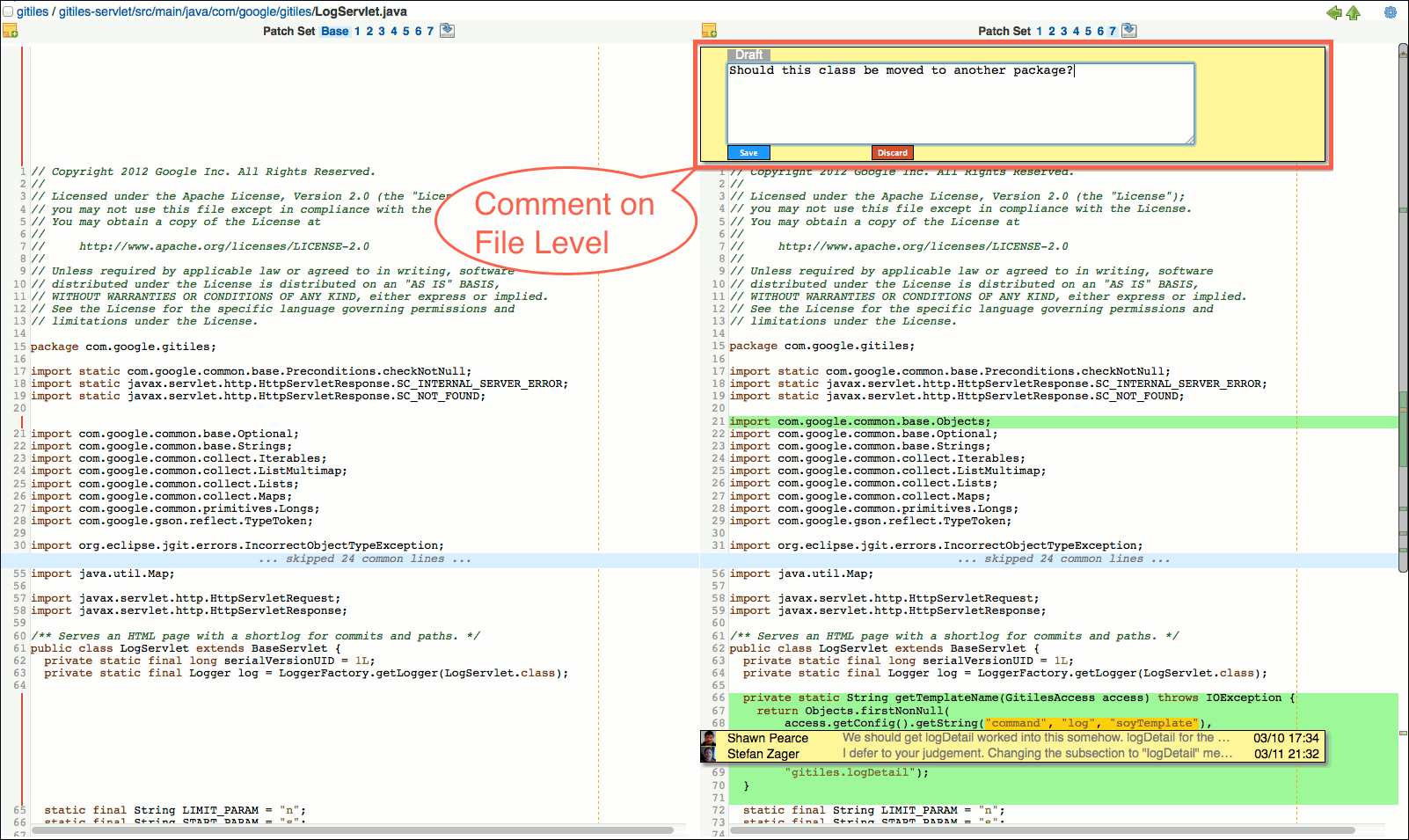
File level comments are added by clicking on the comment icon in the header above the file.
Clicking on the comment icon opens a comment box for typing the file level comment.
Search
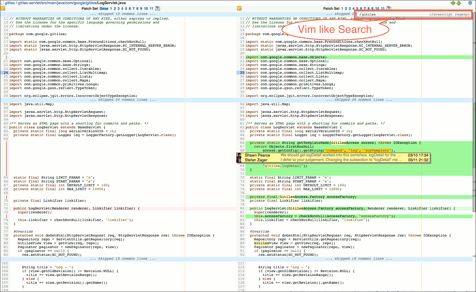
For searching within a patch file, a Vim-like search is supported.
Typing / opens the search box. Typing in the search box immediately
highlights matches in the patch file with a yellow background. Using
JavaScript regular expressions in the search term is supported. The
search is case insensitive. After confirming the search by ENTER one
can navigate between the matches by n / N to go to the next /
previous match. Skipped lines are automatically expanded if they
contain a match and one navigates to it.
For additional possibilities to search please check the
Vim documentation. There are other
useful ways to search, e.g. while the cursor is on a word, pressing *
or # searches for the next or previous occurrence of the word.
Searching by Ctrl-F finds matches only in the visible area of the
screen unless the Render diff preference is set to Slow.
Key Navigation
Vim-like commands can be used to navigate within a patch file:
-
h/j/k/lmoves the cursor left / down / up / right -
0/$moves the cursor to the start / end of the line -
gg/Gmoves to cursor to the start / end of the file -
Ctrl-D/Ctrl-Uscrolls downwards / upwards
Please check the Vim documentation for further information.
Diff Preferences
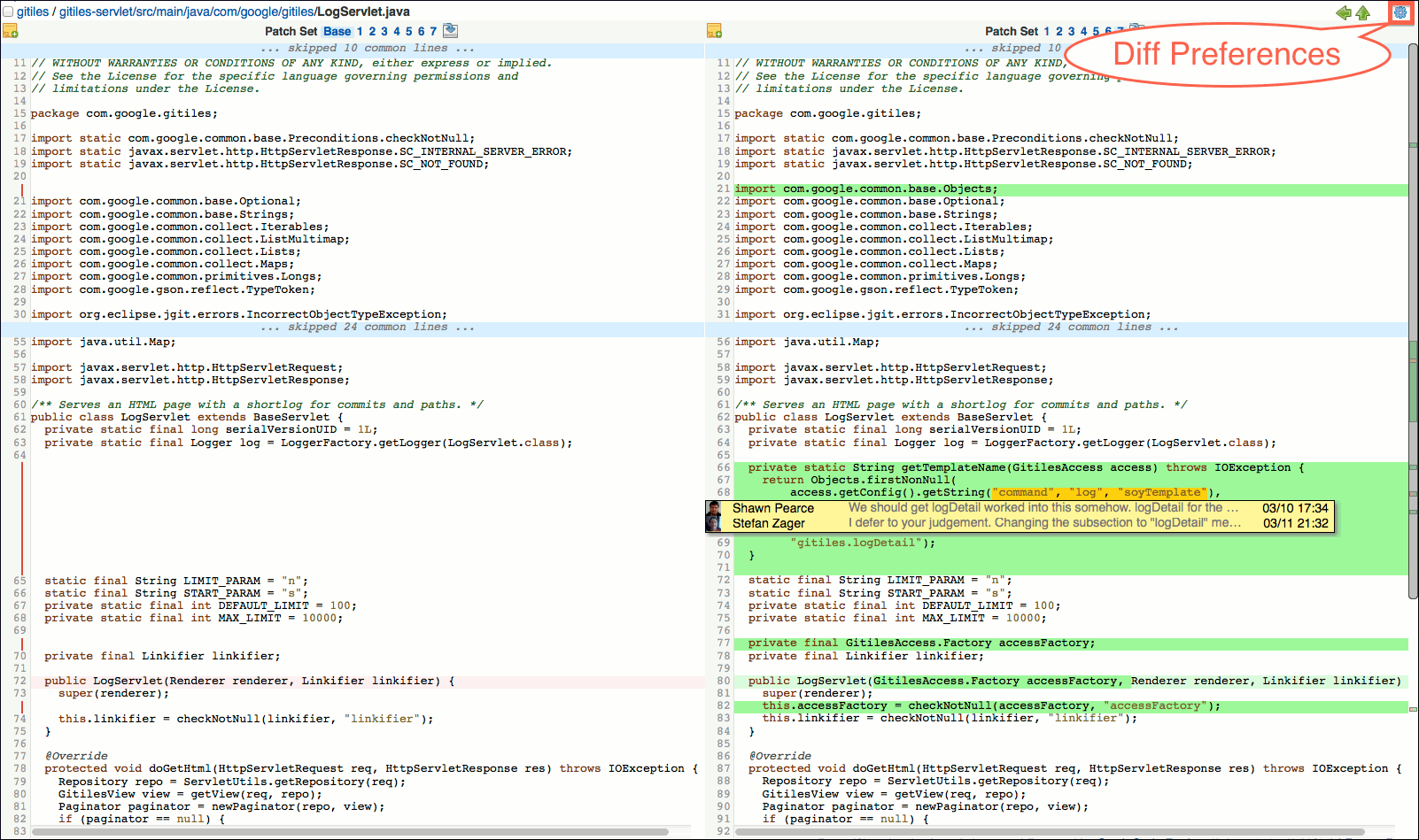
There are several options to control how patch diffs should be rendered. Users can configure their preferences in the diff preferences. The diff preferences can be accessed by clicking on the settings icon in the screen header.
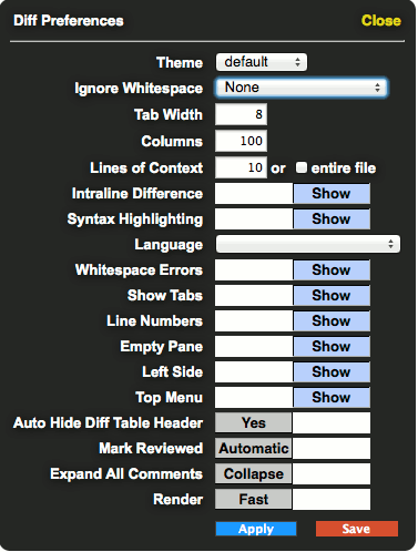
The diff preferences popup allows to change the diff preferences.
By clicking on the Save button changes to the diff preferences are
saved permanently. Clicking on the Apply button applies the new
diff preferences to the current screen, but they are discarded when the
screen is refreshed. The Save button is only available if the user is
signed in.
The following diff preferences can be configured:
-
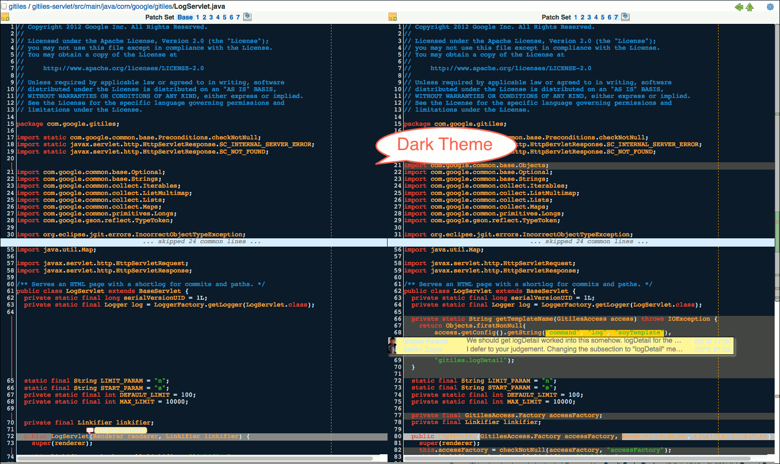
Controls the theme that is used to render the file content.
E.g. users could choose to work with a dark theme.
-
Controls whether differences in whitespace should be ignored or not.
-
None:All differences in whitespace are highlighted.
-
At Line End:Whitespace differences at the end of lines are ignored.
-
Leading, At Line End:Whitespace differences at the beginning and end of lines are ignored.
-
All:All differences in whitespace are ignored.
-
-
Controls how many spaces should be displayed for a tab.
-
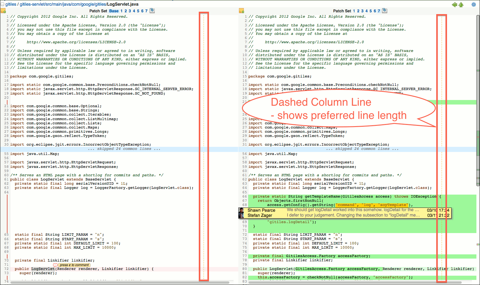
Sets the preferred line length. At this position a vertical dashed line is displayed so that one can easily detect lines the exceed the preferred line length.
-
The number of context lines that should be displayed before and after any diff. If the
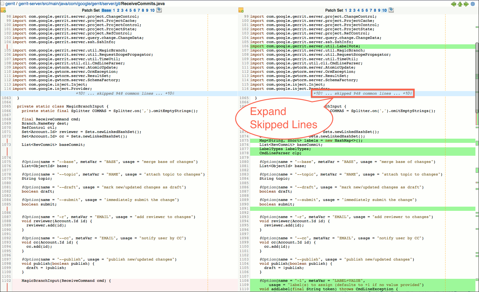
entire filecheckbox is selected, the full file is rendered.Skipped common lines can be expanded by clicking on the placeholder for the skipped lines.
Clicking on "… skipped <n> common lines …" expands the complete block of skipped lines.
If many lines are skipped there are additional links to expand the context by ten lines before and after the skipped block.
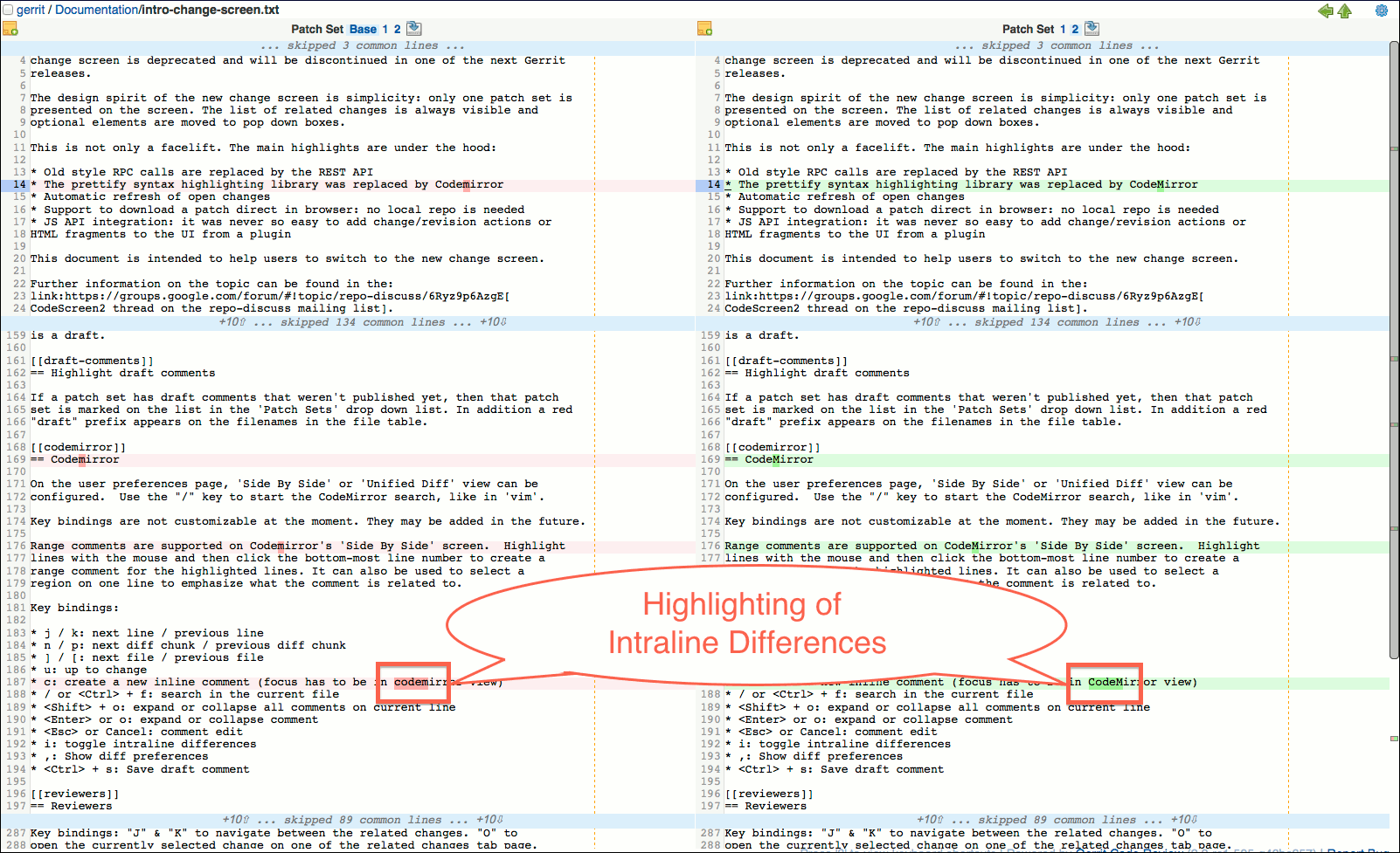
-
Controls whether intraline differences should be highlighted.
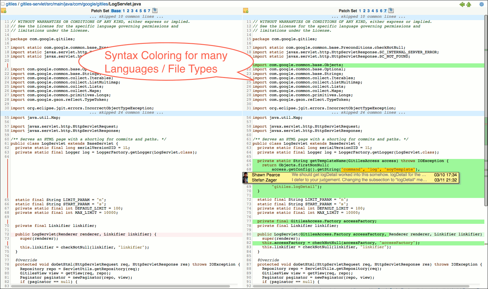
-
Controls whether syntax highlighting should be enabled.
The language for the syntax highlighting is automatically detected from the file extension. The language can also be set manually by selecting it from the
Languagedrop-down list. -
Controls whether whitespace errors are highlighted.
-
Controls whether tabs are highlighted.
-
Controls whether line numbers are shown.
-
Controls whether empty panes are shown or not. The Left pane is empty when a file was added; the right pane is empty when a file was deleted.
-
Controls whether the left side is shown. This preference is not persistent and is ignored by the
Savebutton. Every time a patch diff is opened, this preference is reset toShow. -
Controls whether the top menu is shown.
-
Controls whether the diff table header should be automatically hidden when scrolling down more than half of a page.
-
Controls whether the files of the patch set should be automatically marked as reviewed when they are viewed.
-
Controls whether all comments should be automatically expanded.
-
Controls how patch files that exceed the screen size are rendered.
If
Fastis selected file contents which are outside of the visible area are not attached to the browser’s DOM tree. This makes the rendering fast, but searching byCtrl+Fonly finds content which is in the visible area.If
Slowis selected all file contents are attached to the browser’s DOM tree, which makes the rendering slow for large files. The advantage of this setting is thatCtrl+Fcan be used to search in the complete file.Large files that exceed 4000 lines will not be fully rendered.
-
Controls whether to enable line wrapping or not.
If
falseis selected then line wrapping is disabled. This is the default option.If
trueis selected then line wrapping is enabled.
Keyboard Shortcuts
Navigation within the review UI can be completely done by keys, and
most actions can be controlled by keyboard shortcuts. Typing ? opens
a popup that shows a list of available keyboard shortcuts:
New Review UI vs. Old Review UI
There are some important conceptual differences between the old and new review UIs:
-
The old change screen directly shows all patch sets of the change. With the new change screen only a single patch set is displayed; users can switch between the patch sets by choosing another patch set from the Patch Sets drop down panel in the screen header.
-
On the old side-by-side diff screen, new comments are inserted by double-clicking on a line. With the new side-by-side diff screen double-click is used to select a word for commenting on it; there are several ways to insert new comments, e.g. by selecting a code block and clicking on the popup comment icon.
Limitations of the new review UI:
-
The new side-by-side diff screen cannot render images.
-
The new side-by-side diff screen isn’t able to highlight line endings.
Part of Gerrit Code Review
